App regret; understanding the tech we use and the concept of app use regret

App regret, do you have ever get it?
You know the script; catchy advert plus flashy visual, toss in the use of the word “free” all entice us to explore some new app to be a solution to some percieved need we have to gain time, fill space, have fun or market something. Then we go to use it and it happens; app regret.
I happen to come across this post post the other night on TimeWellSpent and thought it an interesting read. It looked at “time spent online on apps” versus “happiness with the apps”. All too often we are seeing more and more “pitched” messaging about people spending too much time online, or “face in the phone”.
I can’t say I haven’t said or done the same. But I am becoming more conscious of how often I do have my “face in the phone” and missing life in the moment. My own storytelling is rich and complex, so missing out on more to add to it is something I always seek to avoid. It is odd because as amataur photographer, self-taught by my grandfather, I remember him always having his face in the camera “capturing those moments” but also missing out on both being in them and in the moment. Yet, here I am as an adult, and I find myself doing the same things. Knowing that I do this, I try not to stress so much about the amount of time spent. Rather, what I have been looking at is the quality of the time I spend on the apps.
What is my time worth as balanced with what I am looking to achieve with the an app.
Lately I find I am deleting apps more often then ever before. Perhaps it is a growing sense of dissatisfication with the quality of the design or usability; perhaps it is the “free” concept being saddled with an overwhelming number of pop-up ads interfering with the reason I selected the app. In some cases, it is simply regret, in that in the use of them, it is not doing anything for me as a person. No matter the cause – I think with so many new apps in development, and many of us always on the search for the perfect app to do “x”. We must ensure that not only does the usability and quality meet some sense of acceptability – we need to check in on how they make us feel while using them. Going to the trouble to download, pay (or not) an app, then getting aggrivated because of its quirky or wonky design, lack of function or simply poor intuitive instructions is not going to improve my day.
The writers at TimeWellSpent, whose tagline this morning was right on the nose “Let’s demand technology that serves us, not advertising” may be on to something. I was pleasantly surprised to find that TimeWellSpent is actually a Bay Area company – so look forward to reading more about what seems like a growing share mindset from them
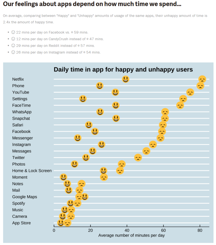
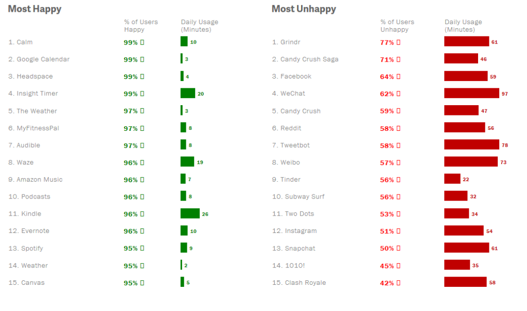
They partnered with Moment; an app that “that helps people track their screen time, to ask how much screen time in apps left people feeling happy, and how much time left them in regret“. It has selection bias but I think it offers us a another potential way to think about when talking to users of apps.
The images below are screen shot that I took from the story., but I encourage you to take moment to read the brief but full story here: http://www.timewellspent.io/app-ratings/
SaveSave
About Frank Strona
As a nationally known writer, educator, advisor, technology, coach, strategic engagement and content specialist, I have been active in the pursuit to improve, educate and promote opportunities that support the engaged learner and business while also preparing the workforce with the tools and skills necessary to stay competitive in a rapidly expanding technology-based world.


